Spotify & Motion Design
Hi music lovers. In short, I recently discovered such a thing as spotify and motion design. Motion is something like animation videos that are relevant for our time, they are made for different products, for example, Apple or Samsung.
And just as spotify recently appeared in Russia, I decided to make a video clip for fun, well, no, I love spots + I will practice making videos. Since I'm not a pro in this area.
If suddenly you have any ideas, or thoughts on this matter, write in the comments, I will definitely take into account!
Idea:
I had the idea to make a video for spotify a long time ago, but due to my incompetence in this matter, I postponed and postponed, but fortunately, the spot burst into the Russian market, it gave me an impetus.
Process:

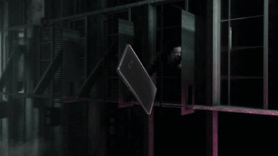
So far it looks like a gray draft, but in the future I will color it and it will be juicy!
In short, they still know for the cross-platform spotify, they say, they even made an application under the microwave. So, this scene reflects all this ins and outs. Watch, iPhone, Nintendo ...

Nothing is clear, right? For me, too, for now, but there is an idea. Here I want to show a huge database of artists and tracks on the platform. These plates will be changed to artist covers and their tracks. Sounds good so far.

I want this color:
Spotify is generally a big topic for ideas, there are a lot of things to refer to. Think back to recommendations or customized playlists, design
in dark shades, right for my mood. I really like the interface and just to it I decided to time the style, dark theme, emerald tones, all that ...
And in general, you need to list all the advantages and benefits of spotify.
If you have any ideas and thoughts on this, I will be glad to see in the comments !! Thank you)
