Cases
"What a tough thing, they didn't even hesitate to add it to their portfolio!"
👆 With such grief, Anna, the manager of the anti-cafe "Always here" ("Всегда здесь" in Russian), turned to us.
The girl said that they ordered the logo from one studio.
The result of their work in this picture 🤦♀
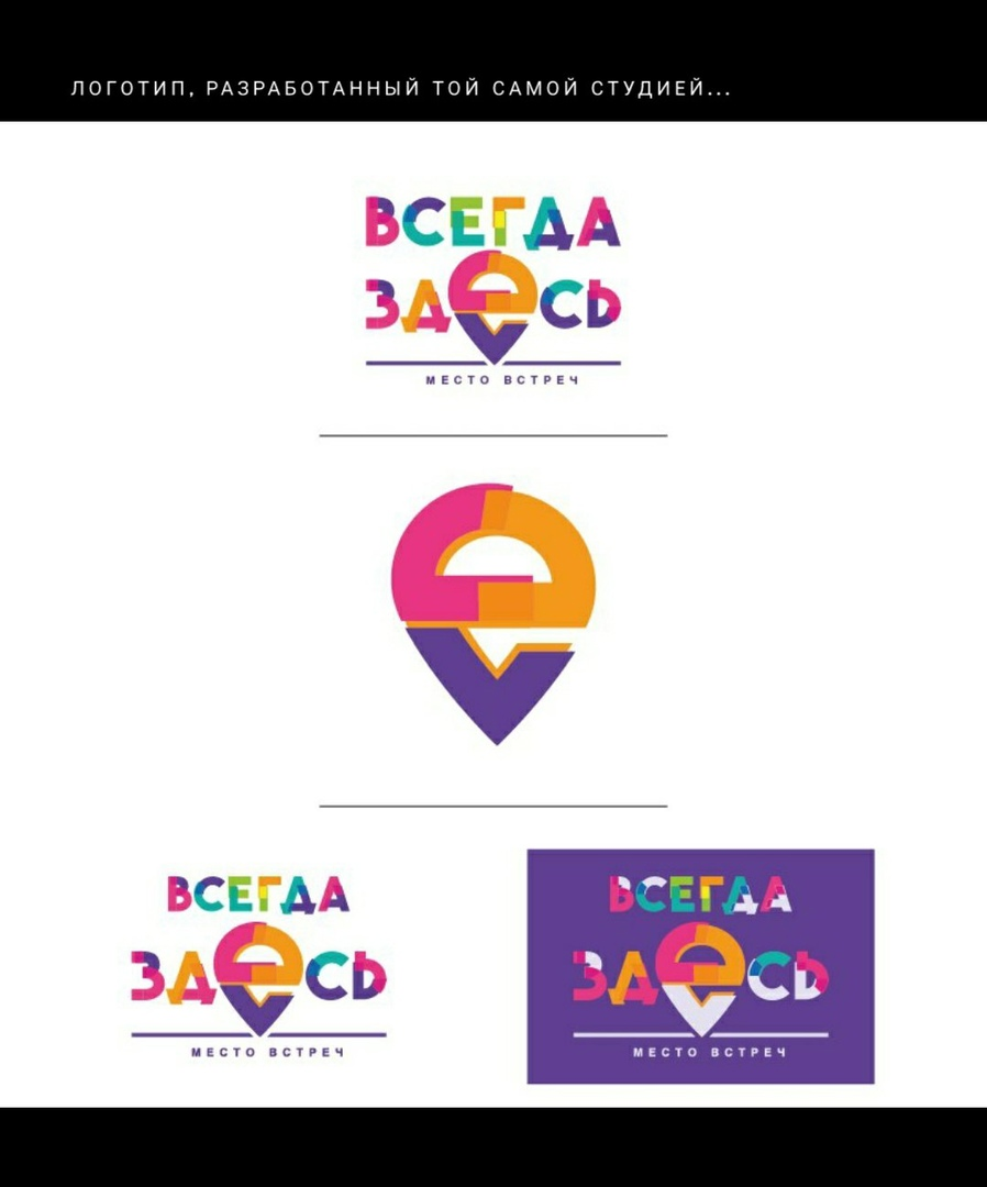
In Anna's anti-cafe, teenagers are playing in GTA on PS4. Girls have bachelorette parties and hang out. Adults play board games, celebrate their days, play Mafia on cozy ottomans.
And those designers are like: "Okay, we have target audiences - people who like to hang out like an adult. Resolved! We make a logo like for a kindergarten!"
Now our solution is to throw out this shame to hell. The sooner the better.
------------------------------------—
We worked according to the standard scheme: We make 3 logos, choose the appropriate one and refine it.
Bottom line: an accurate hit in the target audience in terms of style and a satisfied client. And we did without alterations)
And also we got a kick out of working in neon style!
------------------------------------—
Psss! There is a hidden image in the logo. Will you try to find it?
We worked awesomely with an entrepreneur from Tyumen.


Logo for "The Arkuda" company.
The company produces socks, tights, and sweaters. In general, dudes are engaged in knitwear.
...
The client wanted a bear on the logo. The client received an awesome bear logo🔥.


Landing page design for "Проф мебель" (Profi Furniture)
company 🔥

The company is engaged in the manufacture of kitchens to order.
The client preferred calm tones, and we supplemented this with an elegant kitchen on the right :)
==================================
Recent express logo design for car audio workshop 😎
We associate this niche with neon colors.
In general, we love these gradients.
And how do you like it?

---------------------------------------------------
Logo for clothing brand RAYS


(Client: Maxim Arabok)
--------------------------------------------------------
Logo for the department of implantology in the dental clinic 🔥

=================================================
One of the concepts for the creative association "Art Revival"

================================================
Logo design for a construction company.

Last month we met Sergei. He asked us to design a logo for the XL Date mobile dating app.
On the call, Sergey said that he had already ordered the logo earlier, but was upset with the result.
What is Sergey's mistake?
It's trite that he chose a cheap designer.
What's the problem with cheap design?
The fact that the designer is not motivated, he has little experience and a narrow outlook. There are, of course, exceptions, but usually a cheap designer is a beginner designer.
Well, Sergei got burned and therefore was very worried that he and I would not be able to make a good logo.
The main problem was: "What if you don't like it?"
Here the owner can fall into the trap that we call "business impotence" and which was written about in a post in the past.
In short, its essence is that a person once trusted a freelancer, got burned, and then convinces himself that all freelancers are bad, everything is decay and there is no hope. Is it really possible to build a business with such an attitude?
Fortunately, Sergey did not fall into this trap and was inspired by our statistics: 99% of our clients are satisfied with the logo, and 90% of all design work goes without edits.
We started to cooperate.
____________________
How we worked on the logo:
1) We made an analysis of the target audience.
Users of this application are young people who are looking for a soul mate, company for a trip or travel.
2) Conducted an analysis of competitors' logos.
The dating topic is teeming with logos in the form of message clouds, handshakes and the like.
We have blacklisted all this banal symbolism.
3) We thought about the symbolism.
The main idea is in the name of the XL Date app. This means serious acquaintances, "big dates" - for example, such important events as travel.
Therefore, we decided to use the main object "XL" so that the user can clearly remember the message of the application.
But there is one BUT!
Sergey mentioned that the application's functionality consists of "x" - a pass for the user and a "checkmark" - to select a person for communication.
Thought, thought and came up with!
Decided to tilt the L so that it becomes a checkmark, and voila!

4) Draw ideas by hand to minimize confusion with others. Then we transfer it to a graphics editor.
5) We checked the final result for uniqueness - everything is fine 👍

Drawn in vector.
We handed over the work. As always, there were no edits)
We received such an awesome review that Christina and Rika burst into tears 😅
